
Dopamine App Case Study
UX/UI Design
Career Foundry Project: Design a mobile app that allows health-conscious individuals to access general physical and mental well-being features.
Methods: Competitive Analysis, User Interviews/Surveys, User Testing, Preference Tests, Wireframing, Prototyping
Role: Sole UX/UI Designer
Duration: 7 months (October 2021 - May 2022)
Tools: Figma, Google Forms, Zoom, Procreate, Lookback, Optimal Sorts, Usability Hub, Lucidcharts
OVERVIEW
First things first!
Dopamine allows health-conscious individuals to log in to a responsive health and well-being portal to record their health and medical information and access general, physical, and mental well-being features.
CHALLENGE
Taking everything into consideration.
Creating a health and wellness application that allows users to find all the necessary resources needed while taking into consideration of their personal goals, habits, and conditions.
HYPOTHESIS
Let’s make an assumption!
Our health-conscious users with busy schedules need a way to obtain quick and concise reliable information on mental health, fitness, and general well-being in order to live a healthier/balanced lifestyle while having a secure portal to save their medical information.
We will know this to be true when we see that Dopamine is being used regularly by our users, measured by the average days per month we see the users complete at least one exercise, utilize a resource, or update their health records.


SOLUTIONS
Your one-stop shop for all things health and wellness!
Discover the ultimate wellness app where you can find personalized meal recipes, store and access your health records in one place, and explore a wealth of resources on health, fitness, and well-being. Take control of your well-being with ease and convenience, all at your fingertips.
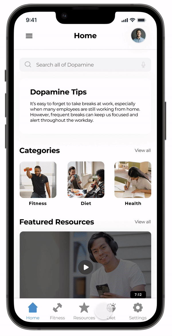
SOLUTION 01
The perfect meal for you
Never worry about having to find a recipe that fits your body type and goals. Dopamine offers you suggested plans and recipes based on your preferences and goals. Not sure what they are? Speak to a nutritionist and get all your questions answered.
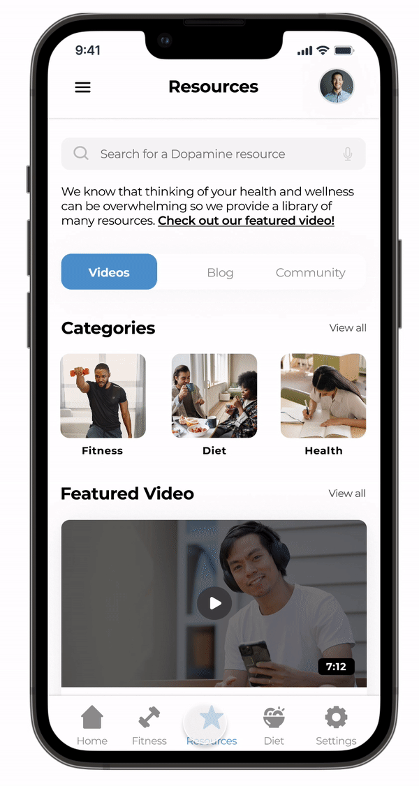
SOLUTION 02
Resources
You can check out all Videos, Blog, and Community of your interest. Each resource section offers categories that will guide you and allow you to be more at ease about yourself and connect with others through these resources in hopes of having a better understanding of what your health and well-being are all about.

SOLUTION 03
All things fitness
Always had trouble finding the perfect workout? Dopamine allows you to browse different categories, create customized plans, and even speak to trainers for advice or attend a live class. Whatever it may be, Dopamine always wants you to feel comfortable when it comes to your fitness and being in your own body.
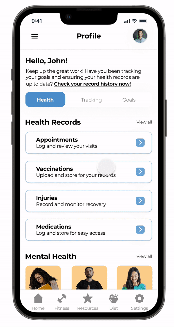
SOLUTION 04
Never forget your vaccine card
Users are able to access their health records from their profile page have been logged into the app. Everyone needs their vaccine card handy, right? Dopamine makes it easy for you to upload and keep a digital copy for easy access.
A closer look at potential users.
USER RESEARCH
I conducted a user survey with 15 participants using Google Forms and interviewed 3 participants via Zoom and In-Person ranging between 20-40 years old that has used a health or fitness app within the past 6 months.
RESEARCH GOALS
Things to consider:
✦ Learn what habits help users live a better lifestyle.
✦ Learn about user obstacles when trying to be healthier.
✦ Learn how users feel about other health and fitness apps.
Listening and understanding users
“I want recommendations for workouts and meal plans in one central location.”
“I find it frustrating having to find physical copies of my health record and documents whenever I need them!”
“I have used an app when it was really difficult for me to drink water to remind me, which was really nice.”

IDEATION
Turning pain points into features
Dopamine consists of many features that will aid in the health and well-being of a user but these are the 3 highlights through the process of wireframing and prototyping.
Diet
Offers you suggested plans and recipes based on your preferences and goals.
Health
Log and access all of your medical and health records in one central location.
Resources
Access to a wide variety of resources in video, blog, and community format that will include all things health, fitness, diet, and general well-being.
INFORMATION ARCHITECTURE
To check if the structure of my app is logical, I conducted an open card sort with 8 participants via optimal workshop. The card sorting itself had positive feedback and allowed me to restructure the hierarchy to something more familiar for users when navigating through the app.
Initial site map vs. refined site map after card sorting
USABILITY TESTING
Putting Designs to the Ultimate Test!
This is where I was able to put my mid-fidelity prototype to the test with real users. I observed how frictionless the users are able to navigate through the app and identified entry points while they completed 2 scenario tasks.
01
You’re planning to focus more on your health this year, but don’t know where to start.
Where in the app could you find a trending video that can help you get started on your journey?
02
You have struggled to find the right meal plan over the past year and now that you have the right health and wellness resources,
you decide to try one of the Dopamine recipes that offer healthier alternatives.
03
With the world we live in now where you need your vaccine card to get into certain places or events, you tend to always forget it. So in preparation for your next travel,
you decide to utilize your medical card feature in Dopamine for easy access.
Results that influence the next steps
With the rainbow spreadsheet, I was able to rank the severity and plan accordingly for the next iterations. For my error rating, I used the Jakob Nielsen Scale.

Usability Testing on Lookback with 6 participants (moderated remote test)
Addressing the issues
I went through the findings that I mapped and sorted out, then chose the top 5 issues that were rated at high severity (3 issues shown below). I needed to make these changes before I created the high-fidelity screens for Dopamine.
Issue #1
Uncertainty of what the categories on the homepage mean
Evidence: All 6 participants were confused as to what the different categories on the homepage meant or where they lead once they were clicked on a card. Most participants knew it was a health and wellness app but questioned if the category buttons lead to resources or its own page or the feature within the services.
Suggested Change: Create a quick onboarding for the categories to explain the overall app after sign-up or more callouts on the homepage screen.
Issue #2
The utility of the vaccine card feature was unclear and the process of how it becomes digital from a photo upload
Suggested Change: Rethink about the whole process of uploading an image, instead I will have the user scan an image of their vaccine card that will transcribe into a digital version of their card and also allow the users the capability of adding it manually. Instead of having it placed just in the app for access, there will be the ability to add it to your wallet.
Evidence: Participants thought it was a great idea but the world is slowly shifting away from proof of vaccination. 2 participants knew what the QR code was used for on the vaccination card but the other participants were confused. 4 out of 6 said that they usually just show an image of their card. 4 out of 6 participants were a bit concerned about the process and questioned how exactly it worked.
Issue #3
Flow of using the recipe was clear but missing key details that the user normally utilizes when cooking or prepping a meal
Suggested Change: Change the overall flow of viewing a recipe and allow the user to customize servings and make sure all of the key details like nutritional facts are added. Make it easier for the user to follow and understand by adding timestamps to the videos and the ability to view the ingredients and instructions on one page.
Evidence: 2 participants weren’t too fond of going back and forth between the two pages from the ingredients and instructions. Most participants wanted an easier way to modify servings for the meal without having to think much about it. 3 participants suggested that they would like the instructions to have timestamps in the video instead of having to scroll through it.

What’s next?
I’ve completed my first-ever UX project (Woohoo!). I definitely learned a lot through this process of end to end design, I hope to continue the journey of becoming a better UX designer as I take on more projects and apply the insights I gained from this.
-
By creating a library of health and wellness resources that is easy to comprehend and enables users to connect with others through the community, we can help our user reach their health goals with ease.
-
The hypotheses will be validated through data analyzation of users activity and engagement of the different resources that Dopamine offers. It will tell us what resources are doing well and if we should change the way we present them to the user. I will also able to look at customer feedback/reviews on this feature to determine how successful it is and possibly conduct user interviews/surveys to ask users how they utilize the given information in their everyday lives to better their health.
-
For the most part everything is good to go for it’s first run and from there we can see what needs improvements. Done is better than perfect. If I had to pick an area that need specific improvements, I would probably have to be health record aspect in making sure that the user fully understand its capability and how they they can rely on this app to keep their information secure. Even though I found solution to the vaccinations feature, it could use some work on the overall flow in making it stand out from other apps or tools used to store this.
-
My ability to gain more precise data from usability testing and user feedback will likely improve as the application becomes more polished. There will be constant test as apps will always have product updates, with that I will learn what’s the best methods and how I can efficiently test. User testing will have less limitations as it will be more established and been through various testing.
-
The timeline for improvement and implementations of the app will greatly depend on what it is that needs to be improved and the type of release. All improvements will happen through the lifetime of the app itself and occur as needed. For this particular need in ensuring resources are being utilized, I must make sure that we are constantly putting out new content and catering to the users needs. There needs to be time set aside for each step of the process, mainly for user testing and analyzation of the data.